
TruEstimate™: Bayut's AI-Powered Property Valuation Tool
I oversaw the end-to-end design process for an AI-powered property valuation tool for real estate agents, owners, and buyers in Dubai.

About Bayut

About TruEstimate™

The deliverables
Entry points that lead to the TruEstimate™ landing page
Landing page with a search widget, previously generated reports, and information about TruEstimate™
Confirm Details modal for the user to edit property details if needed
Contact Details form on a "locked report" page
Email template for when the user receives the report link
Web report template with the estimated value of the property, rental yield information, property history information, recent transactions of similar properties, similar properties listed on Bayut, and a feedback form

The process
Starting initial explorations
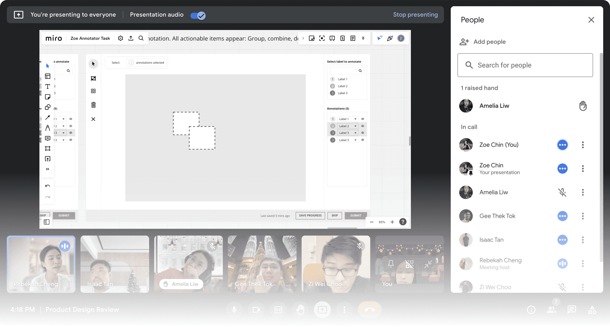
While making sure I don't stray too far from the existing tooling UI on Kaya Tasks, I played around with how I can distinguish annotation tools from image tools.
I explored an image tool panel on the top right of the screen and a dynamic status bubble on the left that would show what mode the annotator is on.

Design reviews with the Product team
Over insights from many discussions with fellow designers and product managers on grouping behaviours, visual options, selecting flows and more, I iterated on the design in stages.
Internal tests with colleagues at SUPA
I had some of the engineers give the prototype a hands-on try to observe a first-time user's interaction with the interface.
This is when I learned that some potential behaviours hadn't been considered and that I had more exploration work to do.

The outcome
Regrouping and renaming existing annotation tools
Converting draw toggles into draw modes with custom icons
Enabling grouping and combining post-selection
Creating a select mode toolbar variant for post-select action items
Enabling multiple ways to group annotations
Creating new components for annotations
Introducing new image tools
Regrouping and renaming existing annotation tools
The existing tools were lumped together with no visual distinction between — whether they were toggles, image tools, or annotation tools.
Reassessing the grouping of these tools, there were essentially 1 draw tool, 1 cut tool, 1 image tool, and 2 draw toggles (Combine and Overlap).
Retained Draw and Cut as main annotation tools
Turned Combine and Overlap toggles into draw modes
Renamed "Overlap-on" Draw over
Renamed "Combine-on" Draw and combine
Moved the Mask toggle to the image tool panel
Converting draw toggles into draw modes with custom icons
Turning the Combine-on and Overlap-on toggles into draw modes also meant having to re-educate our annotators. To aid that process, I created custom icons to visualise each draw mode.
I initially explored renaming the default draw mode "Draw under", seeing that it was essentially the opposite of "Draw over" with the snapback feature.
However, after considering that our users were already accustomed to the behaviour of the default draw tool, we decided that this would present unnecessary confusion.
In the end, we agreed on retaining the default draw tool as Draw and keeping its icon easily distinguishable from Draw over.

Enabling grouping and combining post-selection
On the old tool, a user could only group or combine annotations by first toggling the Group or Combine toggle on before annotating.
Rethinking their make-up, Combine-on was essentially a draw mode, and Group-on was a select-and-apply feature.To solve this discrepancy in behaviour, I had to reposition these features where they belong.
Turned Combine-on into a draw mode
Included Group and Combine as post-select action items
Renamed the Combine tool in the post-select flow Unite to distinguish it from the draw mode
Creating a select mode toolbar variant for post-select action items
Seeing that users won't be needing to use post-select buttons (such as Group and Combine) before selecting any annotation, I created a select mode toolbar variant for only post-select action items.
By only showing users the Group and Combine buttons in select mode, we save screen real estate on the default toolbar and avoid presenting distractions with disabled buttons.

Enabling multiple ways to group annotations
While conducting internal tests, I asked participants to show me what they would do to group multiple annotations together as one instance. Some interactions I observed had inspired the outcome of the tool.
I decided to include 3 ways to group annotations for more flexibility.
Group button
Selecting more than one annotation and clicking the Group button on the toolbar.
Right-click
Selecting more than one annotation, right clicking, and selecting the Group option.
Drag-to-group
Dragging one or more annotations into another.


Creating new components for annotations
While designing the annotations panel, I kept in mind the basic tasks that our users must be able to perform.
Features to include
Hide and show annotations
Delete annotations
Select single annotation
Select multiple annotations
Change an annotation's label
To show users what they can do with an annotation on an individual level, I enabled a hover state that displays the Hide, Delete, and Select icons upon hover, along with a dropdown for changing an annotation's label.
In select mode, the Hide and Delete buttons only show on the master action bar. This is to make it clear that post-select actions will apply to all selected items.

Introducing new image tools
Image tools are tools that temporarily alter the user's view of the image to aid annotation.
Seeing that the Mask toggle from the old tool served that purpose, I included it as part of the image tool panel along with the Zoom In / Zoom Out buttons, and 2 new features — Rotate and Brighten, which were among the most highly requested features.

Introducing new keyboard shortcuts
Keyboard shortcuts are among our users' best rated features. This prompted us to include shortcuts for all existing and new annotation tools and image tools.
I sectioned the Keyboard Shortcuts modal into two parts — General and Image tools — to make scanning easier for users.

Reflections
Fresh eyes and second opinions go a long way
Apart from internal tests with my colleagues at SUPA that helped me uncover blindspots — weekly reviews, check-ins and consistent moral and technical support from the Product team sustained me throughout the 4-week design process and helped me arrive at a well-rounded outcome.

Handover docs are worth the pain
It was worth putting in a little more work and attention to detail to help engineers understand my designs better. It helped not only engineers but also product managers and designers in finding information about the behaviour of my design elements.

The prototype
View Prototype
