
Urban Dictionary Passwords refresh
I gave Urban Dictionary Passwords a fresh look with better grouping, easier scanning, and a renewed focus on customized password generation.
Urban Dictionary, founded in 1999 by Aaron Peckham, is a crowdsourced English-language online dictionary for slang words and phrases.
As a UI/UX Designer at Urban Dictionary, I worked with Aaron on designing or redesigning UD sub-sites to encourage discovery and improve conversion rates.
Urban Dictionary Passwords was created as a fun little way for people to generate strong passwords with words, numbers, and symbols.
This simple tool is different from other password generators in such a way that it emphasizes on humour and memorability in password creation.
Showing people funny definitions of the words that make up their password might help them remember their password better.
The problem
Project objectives
As the original site was created sans design input, the main goal of this project was to improve the general look and usability of Urban Dictionary Passwords and potentially make it the people's go-to tool for password generation.
A summary of the project goals:
Improve usability and readability
Create visual focus on the password and main action items
Accentuate customization controls
Improve mobile experience
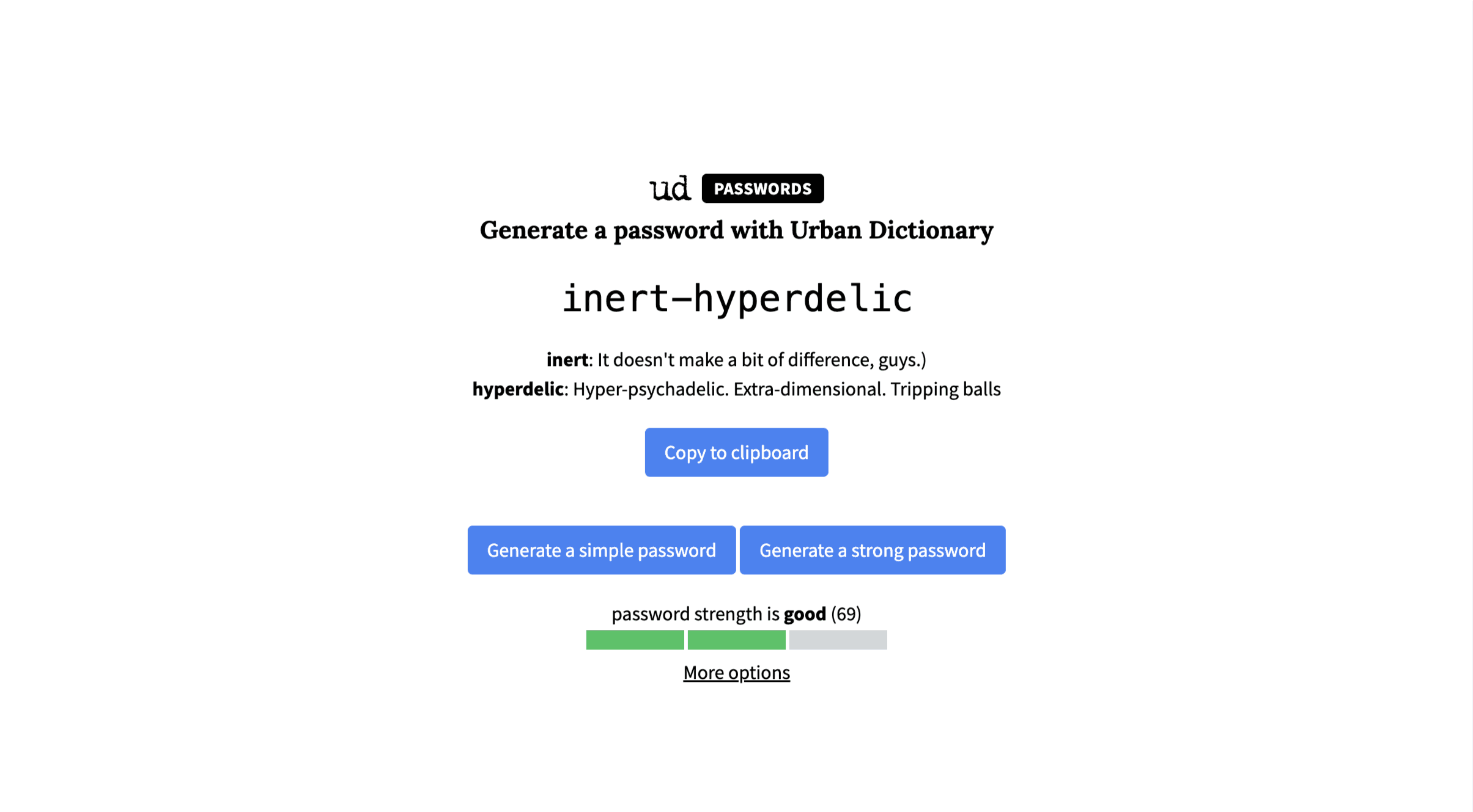
On the original design, all three major action items share the same styling — Copy to clipboard, Generate a simple password, and Generate a strong password. At first sight, users are't likely to be able to tell which action to take.
Customization options were chucked away in a tiny underlined More options button. Users who visit to create a password with specific requirements may find it difficult locating the button, or even completely overlook it.
When a password and its definition got on the long side, it also got a little dizzy. There was no maximum width set for the site's content, and hence text could span across the screen from end to end.
Content also shifted vertically whenever a user switches between simple passwords and strong passwords, which was terribly disorienting.
The outcome
Features snapshot
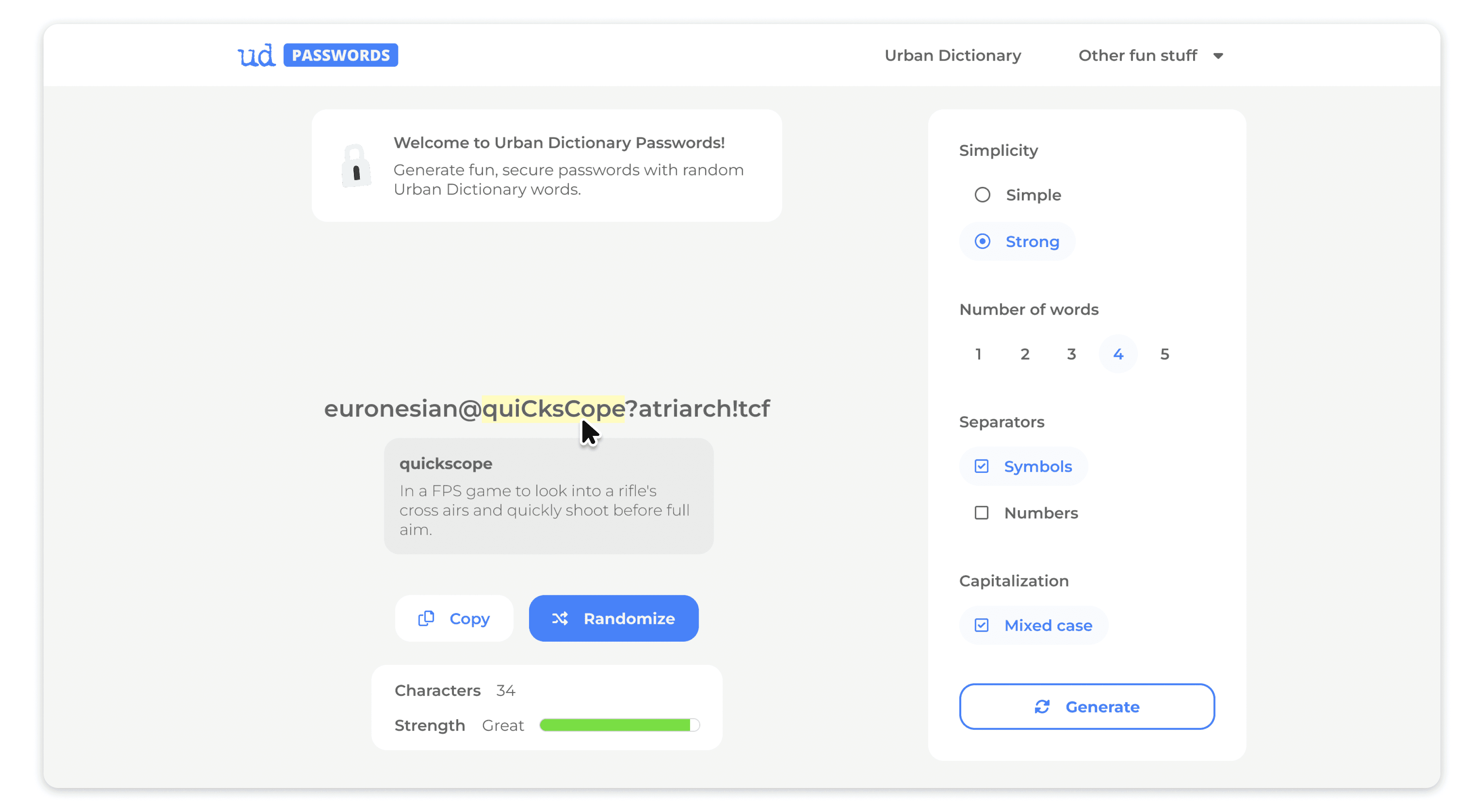
Refreshed grouping by function
Spotlight on the password
Primary, secondary, and tertiary CTA buttons
Customization controls displayed by default
Definitions appear upon hover
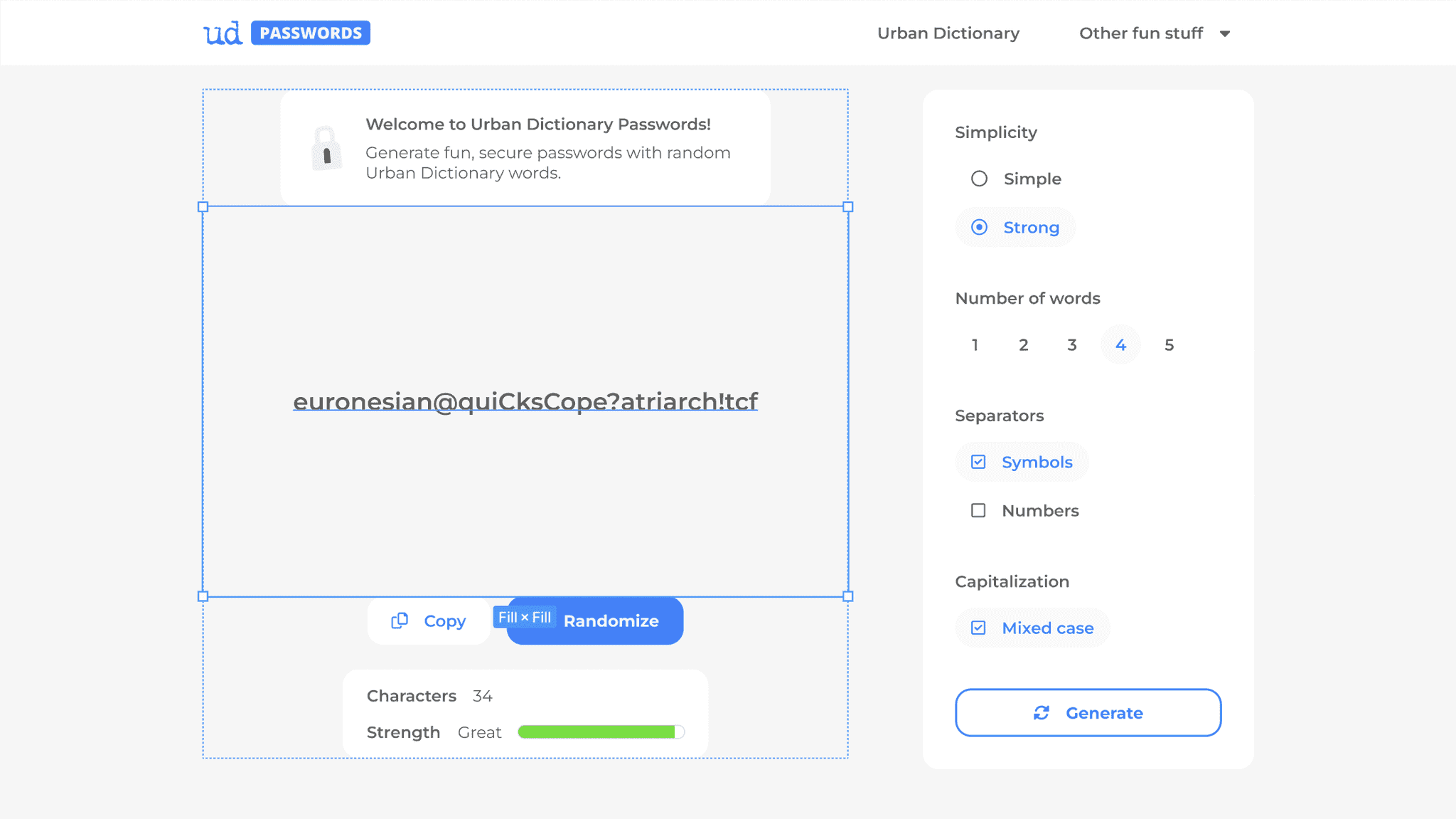
The renewed layout organizes and groups features by their function. I sorted all elements on the site into 5 main categories — (1) Site and description, (2) Password, (3) Main action items, (4) Password attributes, and (5) Customization — and organized them into separate containers for easier scanning.
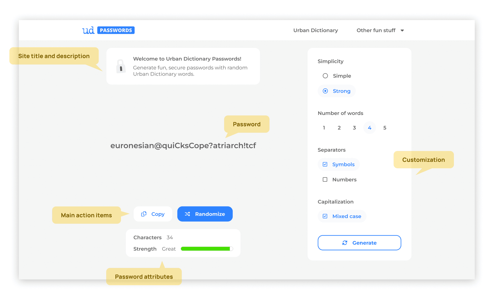
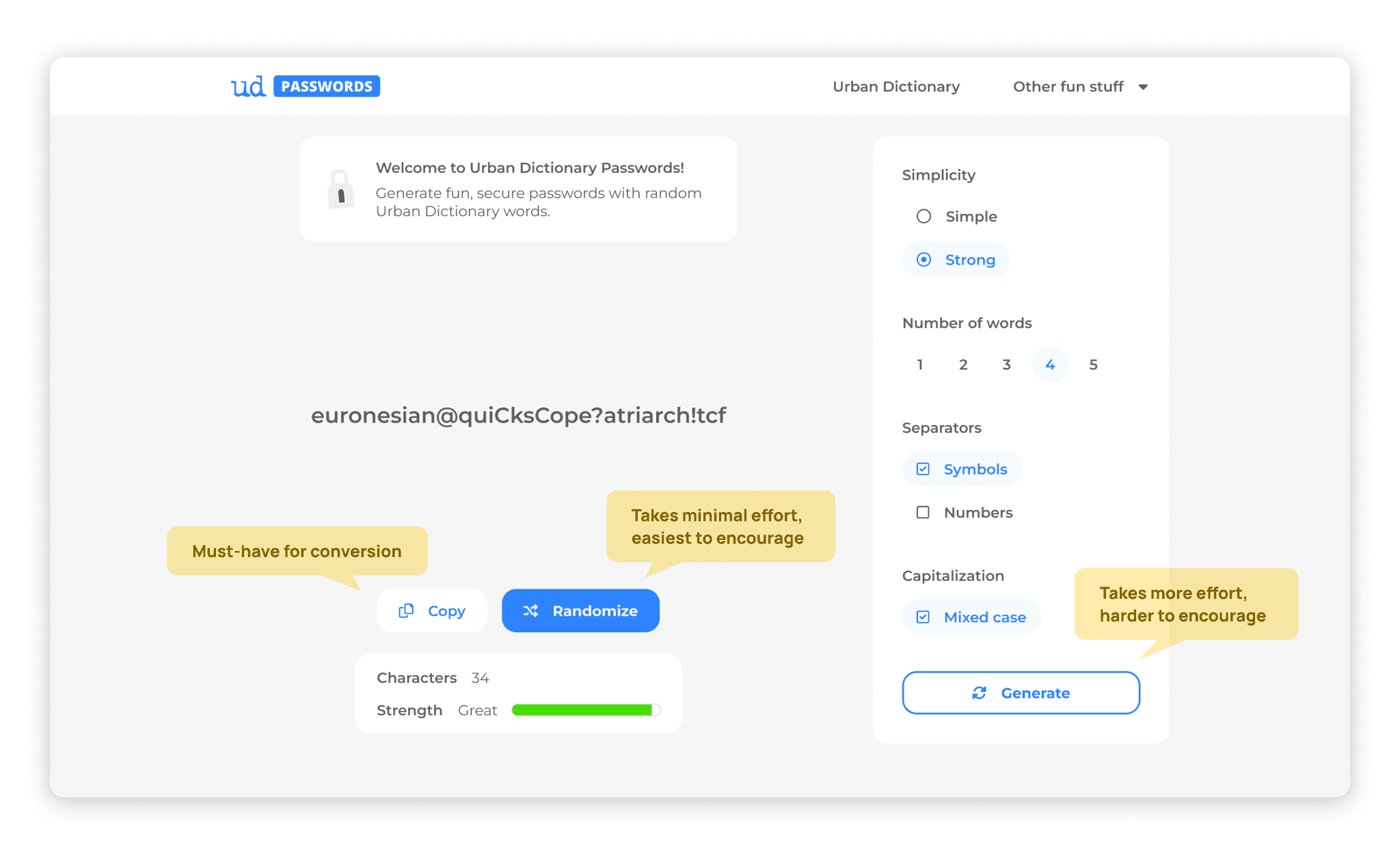
While thinking about layout, I first decided who the main character was on the page. Without a doubt, with this being a password generator, the password should be the main focus on the site. To give it the attention it needs, I reserved more than 1/3 of the main content space for the password and assigned it the biggest, boldest font on the page.
Putting myself in the shoes of someone visiting to generate a password, I wouldn't want to have to do too much thinking. Instead of wondering for a second if I should generate a simple password or a strong password, I'd want to just get on with it and look at random suggestions.
This is how I decided to limit the page to a single primary CTA button (Randomize) and a single secondary button (Copy) — positioned right beneath the password to demonstrate a direct link to the password displayed.
I also placed a Generate button in the customization panel that only randomizes within the bounds of the customization settings. This button was assigned tertiary importance because it is essentially an action that requires more effort, and hence, would take more effort on our end to encourage as a user's first and main course of action.
Unless it's all for fun, most people use password generators with certain requirements already in mind. Chances are, they're creating an account somewhere that most likely requires a password with at least one symbol, number, or capital letter — and they need a password. This called for customizations to be highlighted as an important part of the site.
Since I'd reduced the Generate a simple password and Generate a strong password buttons into a single Randomize button, I also turned the simple/strong option into a setting on the customization panel.
To avoid cluttering the screen with text, I hid the definitions of the words within a password by default, and made it so that it appeared only upon hover — if the user wants to see them. The definition bubbles were also assigned maximum widths to ease readability.
With limited screen real estate on mobile, it was a challenge for me to enable customization and viewing definitions while avoiding instances where the user loses view of the password.
To solve this, I positioned the Generate button on top of the customization controls, where it will always be visible within the viewport. This way, users will be able to tap on it repeatedly without having to scroll back up each time they tap the button.
I also designed the definitions in a way that they appear below the words, so users don't lose sight of their password while reading.
The prototype