
Supabolt sign-up page redesign
To prime it for its transition into Supabolt, I gave Databolt's sign-up and sign-in flow a refresh with SUPA's new brand colors and unique selling points.

About Databolt

The problem
Nothing beyond bare minimum
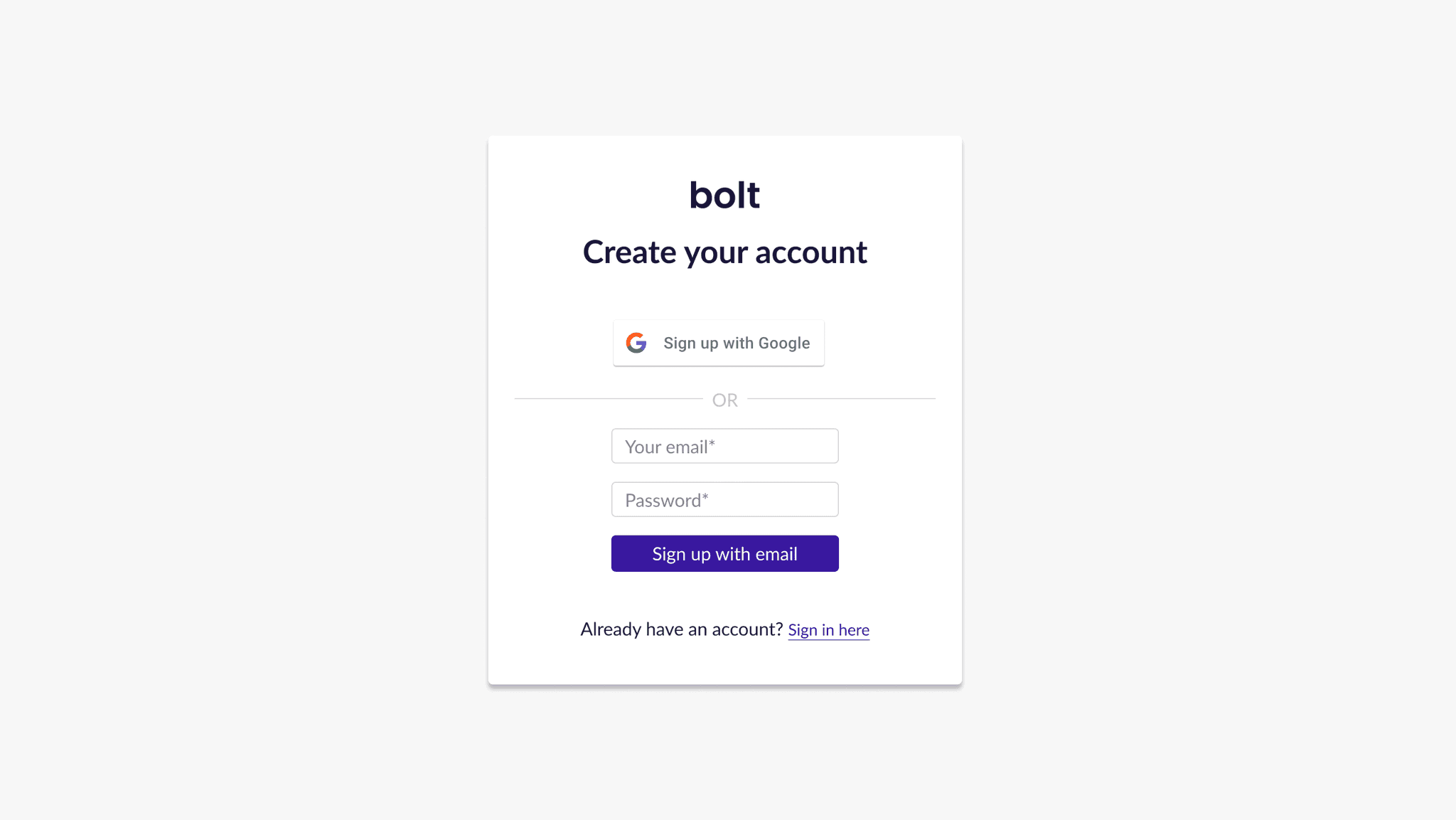
Back when the team was prioritizing shipping the Alpha version of Bolt, the old sign-up and sign-in page was built on the fly. At the time, shipping fast and testing with our users were our primary focus.
As a result, the sign-up page functioned, but wasn’t attractive. Visitors could do the bare minimum of signing in and signing up on our sign-up page, but that was as far as its value went.
Visually, our sign up page lacked too. Design elements and error messages weren’t consistent, which could have put our users off as a sign of careless and thoughtless work on our end. That didn’t align with who we are — a team that cares about accuracy and trust.
The process
Creating just the right amount of push with content
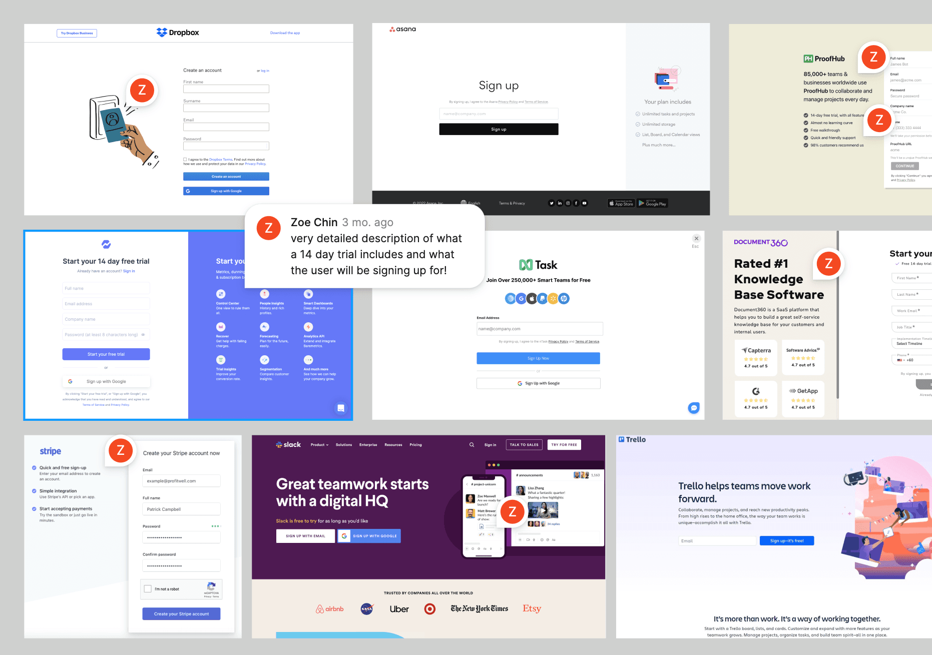
Before jumping into the work, I gathered insight on what other B2B SaaS product sign-up pages looked like, taking screenshots from leading examples like Dropbox, Trello, Stripe, and Slack.
I noted down what I found great about each one of them and discussed each example with Supabolt’s product manager.
We decided to display our value proposition in 3-4 points on our sign-up page, to give our users just enough value and push.
To keep things consistent with our website content, we pulled 4 USPs that stood out the most from our existing site — ones that highlighted ease of use, quality, control, and affordability.

My team and I spent some time deliberating on how we should display our value proposition, circling around the question: How do we give our users enough value without overloading them with information?
To find out, I explored 4 different ways of displaying our USPs in text, and ran internal tests on them.

After rounds of discussion, we eventually went with Option B, stripping our USPs down to their headlines and only revealing their descriptions upon hover.
We found that this behaviour gives users more control over the information they want to receive, and creates a cleaner, gentler, and much less overwhelming look.
Priming Databolt's rebrand with color
Following our rebrand from Supahands into SUPA, our plans for Databolt also include a brand refresh. Seeing that there was quite a stark difference between our new SUPA red and the Databolt blue, I explored blending the two with a gradient to signify the transition from one to the other.

However, the team decided that if we were going to eventually work on Databolt’s transition into Supabolt, we should go bold with our new red and stick with it.
For better readability and a more dynamic look, we eventually agreed on a gradient that mixed our SUPA red with a darker shade of red. Moving, organic gradients were explored but deprioritized for a sooner launch.
Minimizing distractions with layout
Another concern to address was how we were going to inform our users without distracting them from the main action we were trying to encourage — signing up for Supabolt.
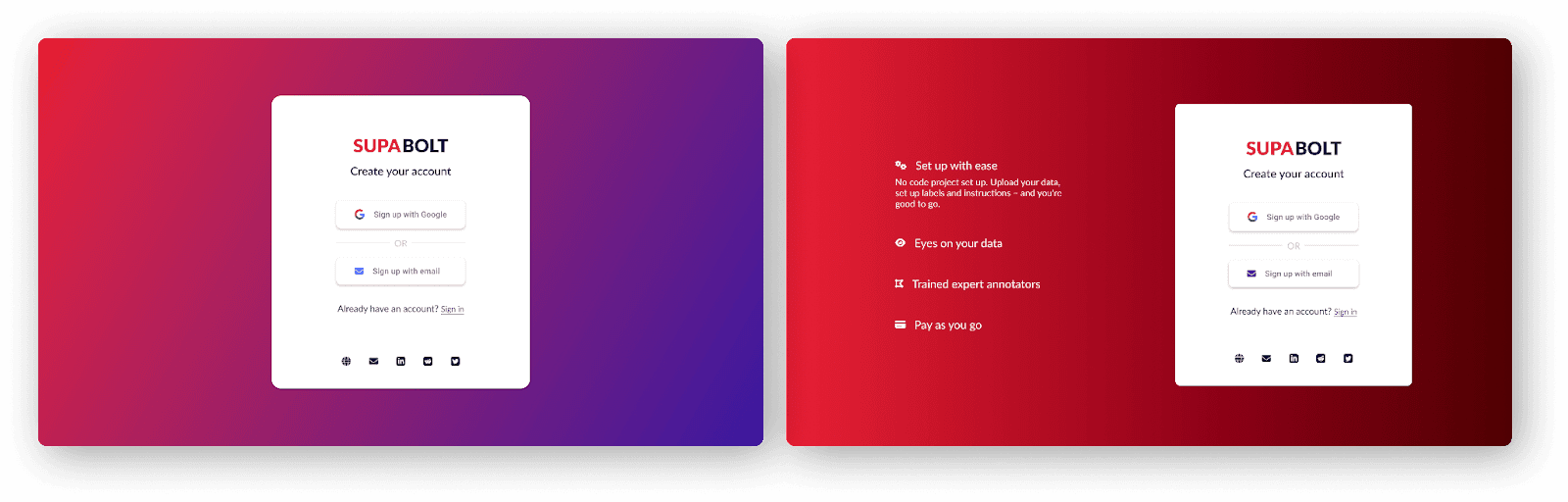
A split screen layout made the most sense as it allowed for our value proposition and sign up form to coexist on the screen without fighting for attention, while at the same time create a clear distinction between information and action.

Seeing that there was no need for a returning user to see our USPs every single time they get to the sign-in page, I also omitted the info section on the left from the sign-in page. Instead, we decided that the info drawer would only show on the sign up page. This way, we
Only show our value proposition to those who are looking for it
Don’t disrupt our returning users from signing in to Supabolt
Encouraging discovery with social icons
Social icons were discussed as a way for our visitors to learn more about us and Supabolt, and to help them make a decision on signing up with us.
Through some internal testing, I quickly learned that positioning social icons on the right — where the sign-up and sign-in forms are — may distract users from signing up or signing in, and even mislead them to think that these icons represent additional social sign-in or sign-up options.
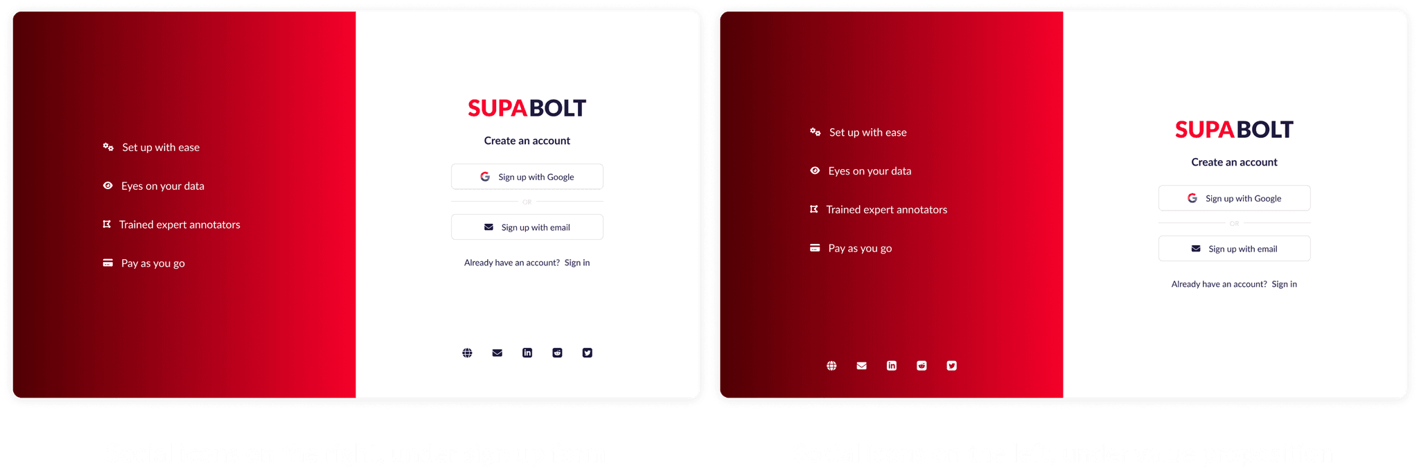
As a result, I moved our social icons to the left side of the page to visually group our social profiles with our selling points. This way, we dedicate the left half of the screen for discovery and the right purely for the main action items — signing in and signing up on Supabolt.
Explorations that didn't make the cut
A toggle that switches between signing in and signing up

The problem with the toggle was its lack of utility. The team decided that although this was a fun element to have, it wouldn’t be something that users find useful, since toggles are typically used for quick and frequent switching between two modes. This may backfire and turn out to be a distraction to our visitors from the main CTA — which is to sign up as a user.
Card designs
I also considered placing all actionable items including the sign up button, sign in button, and social icons in a card, with our value proposition outside of the card.
This option eventually lost out to the split screen layout for a couple reasons — most of us favoured the split screen visually and liked that there was more of an equal share of space between the information and action items on the screen.
A custom, animated gradient
This was my favourite — I explored an animated gradient for a more impressionable visual effect. However, the team came to a consensus that it would be difficult to implement without compromising development time and loading speed.

Reflections
My designs won’t always come out as planned (and that’s okay).
It's easy to assume that just because a design exists on some other website, my team can definitely replicate it. But the truth of the matter is — in most cases — we need to make do with the resources we have, or prioritize shipping fast over implementing advanced effects or interactions.
Being flexible enough to make compromises without compromising quality is an important skill and mindset that a designer should have. Sure, it was sad to have to accept that we couldn't implement an animated gradient with moving blobs or a slide-in animation for the info drawer, but I'm glad I learned a few things:
The different ways gradient animations can be implemented and the tradeoffs that come with each of them
How complex it can be for engineers to exactly emulate animations from wireframes
To check with engineers early on feasibility
The importance of feedback and user testing

The prototype
View Prototype